
Foundations of Accessible Document Design: Colour
- Jen Nugent
- May 27, 2024
- 4 min read
Updated: Jun 10, 2024
This article is the sixth in a nine-part series covering the basic principles of digital document design. Begin with our first article and follow along for more digital document design tips!
What’s your favourite colour? That’s a question many of us have been asked since we were young. And as we aged, our preferences probably changed. The marker we reach for to write our name tag at a workshop; the paint we choose when redecorating our house; even the vehicles we buy based on the exterior finish. Whether purposeful or subconscious, we make a lot of decisions based on colour.
While colour can be a fantastic means of personal expression, its use in documents often leaves something to be desired. Like typography, your colour choices play an important role in accurately communicating information. When designing accessible digital documents, careful attention should be paid to the way you use colour.
Select the graphic for a full-screen display of the Accessible Document Checklist.

Select to expand for full description of Accessibility Document Checklist graphic.
Assign a clear title
Use headings for easier navigation
Keep it simple with plain language
Use lists to organize your content
Choose readable typography
Be mindful of how and and why colour is used
Include alt text for all visuals
Use tables for data, not layouts
Include descriptive link text
Rule No. 6: Be mindful of how and why you use colour in your document
There’s a big difference between adding a colourful border to your document and using colour to communicate your message. The decorative use of colour typically has minimal impact on a reader’s comprehension. But when colour is used for emphasis or to convey meaning, it can make it difficult for all readers to access your information. To create an accessible digital document, it can help to reflect on how you’re using colour (as in, your actual colour choices), and why you’re using colour (meaning, what is the reasoning for using different colours).
How does the use of colour impact the readability of my document?
There are two primary ways that colour can impact an individual’s ability to read your document:
1. Colour contrast
Colour contrast refers to the difference in light between text and its background (or other elements, like the slices in a pie graph). For example, black text on a white background has high contrast because the two colours are very distinct from one another. Contrast is important for everyone, but is particularly beneficial for folks with visual disabilities. Using low-contrast colours can make it difficult for people with low vision or colour blindness to read the content on the page.
Select the graphic for a full-screen display of incorrect versus correct colour contrast.

Select to expand for full description of incorrect versus correct use of colours for meaning.
Text on background
Incorrect: Low colour contrast - white text on pale yellow background.
Correct: High colour contrast - dark blue text on pale yellow background.
Graphic elements on background
Incorrect: Low colour contrast between pastel green, purple, and pink pie slices in chart. Pie slices also have low contrast with white background.
Correct: High colour contrast between green, purple, and red pie slices and white background. Chart also makes use of white border to create high contrast between pie slices.
2. Colour used to convey meaning
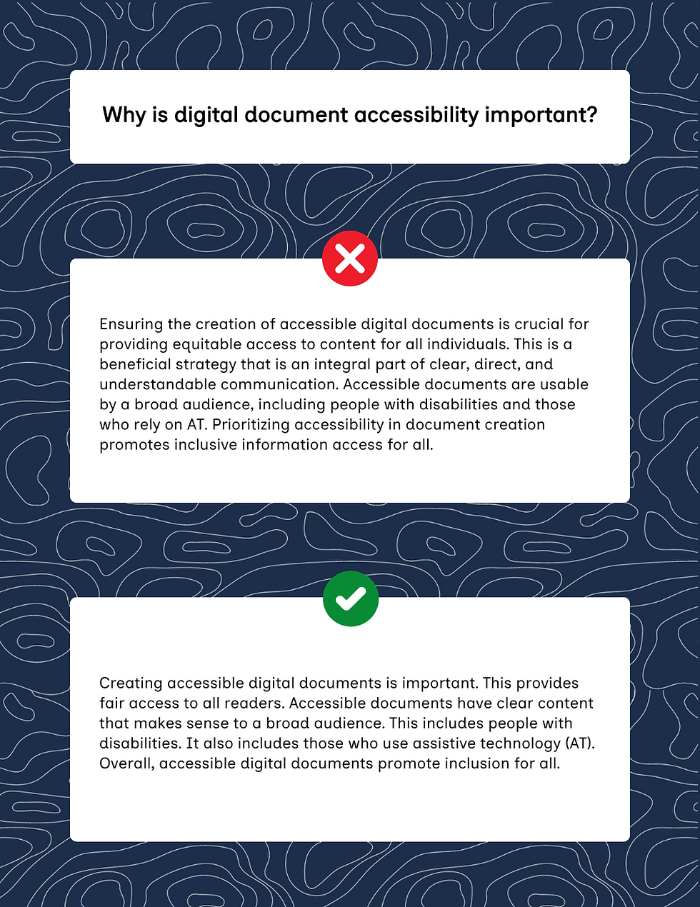
For many of us, we associate certain colours with certain meanings: red means stop; green means go; yellow means speed up (or proceed with caution - dealer’s choice). Because of these associations, you might want to use colour-coding to communicate information in your digital documents. However, assistive technologies like screen readers can’t interpret colours. If you were to write, "All information listed in blue is new," a screen reader wouldn’t be able to identify which text was blue (and, more importantly, what information is new). Remember: text is the foundation upon which all accessible content is built. Make sure that all important information is available in text format for assistive technology users.
Select the graphic for a full-screen display of incorrect versus correct use of colour for meaning.

Select to expand for full description of incorrect versus correct use of colours for meaning.
Example # 1: Table
A table is used to display the names of three projects and their statuses:
E-Learning Module Creation (Completed)
Training Program Update (In Progress)
Instructional Video Production (On Hold)
The incorrect example uses colour only to convey meaning. In the right-column, blocks of colour are used to indicate the status of each project. A legend is provided to state what each colour means. Colour is required to identify the status of each project.
The correct example uses a combination of colour and text to convey meaning. In the right-column, blocks of colour and text are used together to indicate the status of each project. Colour is not required to identify the status of each project.
Example # 2: Pie Chart
The incorrect example shows a pie chart with three pieces. The percentage of each piece is listed in a colour-coded legend. Colour is required to understand the chart.
The correct example shows a pie chart with three pieces. The percentage of each piece is listed on the piece itself. Colour is not required to understand the chart.
Best practices for using colour in your document
Ensure there is adequate contrast between text and its background. Contrast is measured as a ratio between two colours. Text and its background must have a high contrast ratio to be legible. The minimum contrast ratios are:
Small text: At least 4.5:1
Large text (18pt or larger, or 14pt bold or larger): At least 3:1
Ensure there is adequate contrast between non-text elements and their background. Your document may include non-text elements that convey meaning, such as lines in graphs, pie chart slices, or list bullets. These elements should also have a colour contrast ratio of at least 3:1 to ensure they are distinguishable for all readers.
Confused by what these ratios mean? Don’t worry - there are tons of great colour contrast checkers available online. We love the (free!) WebAIM Contrast Checker for quick and easy testing of the colours in your digital document.
Avoid strong background gradients or patterns. Background patterns and gradients can make text difficult to read and distract some readers. It's best to avoid them whenever possible. If you must use a background pattern or gradient, ensure that even the areas with the least contrast still meet the minimum contrast requirements for readability.
Don't rely on colour alone to convey information. While colour can make your document look nice, it shouldn't be the only way that you communicate your message. To ensure your document is accessible, try viewing or printing it in grayscale. This will help you identify any information that is only explained using colour distinctions.
Include all essential information in text format. Screen readers and other assistive technologies rely on text to convey information to users - they can’t identify the meaning of different colours featured in your document. It’s crucial that all important information is available in text form.
Designing accessible digital documents requires thoughtful consideration of colour use to ensure readability and inclusivity. By paying attention to colour contrast and avoiding reliance on colour to convey meaning, you can create documents that are accessible to everyone.
Get ready for the next installment of our Foundations of Accessible Document Design series where we discuss the importance of alt text for images.


Comments