
Foundations of Accessible Document Design: Typography
- Jen Nugent
- May 17, 2024
- 3 min read
Updated: May 27, 2024
This article is the fifth in a nine-part series covering the basic principles of digital document design. Begin with our first article and follow along for more digital document design tips!
Fonts are an incredibly divisive topic. Just ask Ryan Gosling’s character in the 2017 SNL short Papyrus. Although most of us aren’t haunted by any one font in particular, it’s not uncommon to have a specific reaction to a font choice (don’t get me started on Times New Roman). Fonts are all around us - from the logos of our favourite brands to the text on greeting cards, fonts play a significant role in conveying messages and capturing attention in our daily lives.
Professional, modern, whimsical - with so many fonts to choose from, digital document design may feel like the perfect time to unleash your inner creativity. But when it comes to accessibility, there are a few important elements to consider to ensure your document is accessible to everyone.
Select the graphic for a full-screen display of the Accessible Document Checklist.

Select to expand for full description of Accessibility Document Checklist graphic.
Assign a clear title
Use headings for easier navigation
Keep it simple with plain language
Use lists to organize your content
Choose readable typography
Be mindful of how and and why colour is used
Include alt text for all visuals
Use tables for data, not layouts
Include descriptive link text
Rule No. 5: Design your document using readable typography
When you hear the term “readable”, you might first think of content and the importance of using plain language to convey your message. But the term readable can also be applied to the visual appearance of your text. When creating a document, your typography choices play an important role in communicating information effectively. Careful selection of fonts, font size, emphasis, and spacing will enhance your document’s readability.
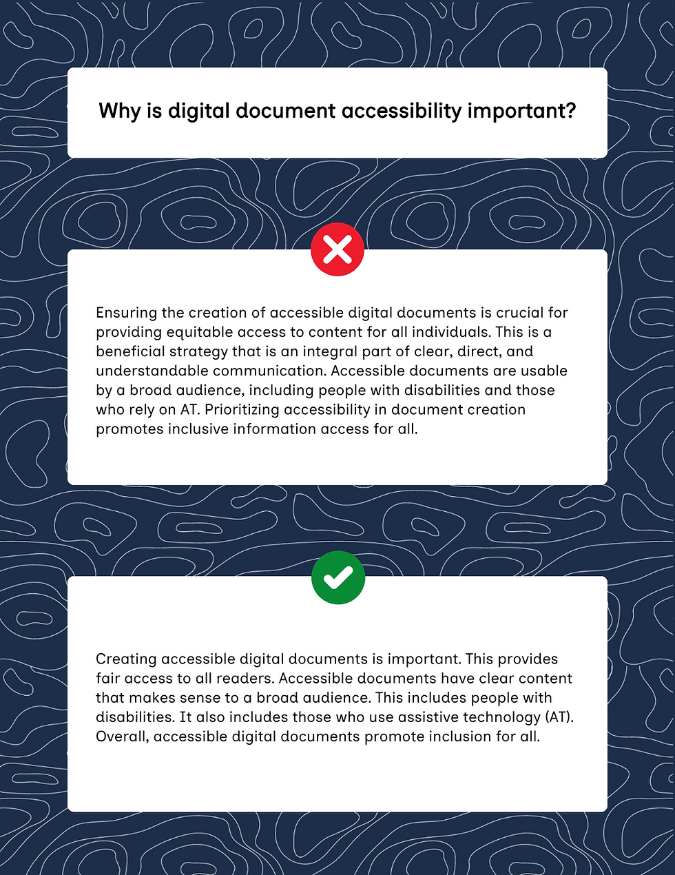
Why should I use readable typography in my document?
To put it as plainly as Comic Sans, readable typography makes your document easier to read. Accessible fonts respond to the needs of a wide range of readers. For example, individuals with dyslexia benefit from fonts with distinct characters that can’t be mirrored. Folks with low vision benefit from fonts that are not too small and text that is not crowded together. And even screen reader users benefit from careful attention to the use of typography. While bolded text may signify importance to sighted readers, it’s important to remember that any information conveyed visually must be conveyed textually, too. Always keep your diverse readers in mind in your typography design. This will help you create a document that is inclusive of everyone.
Select the graphic for a full-screen display of lincorrect versus correct font.

Select to expand for full description of incorrect versus correct font.
Incorrect font: Arial.
Indistinct characters: The uppercase “I” and the lowercase “l” look the same.
Mirrored letters: The lowercase “d” and the lowercase “b” look the same when flipped or reversed.
Correct font: Georgia.
Distinct characters: The uppercase “I” and the lowercase “l” look different.
Non-mirrored letters: The lowercase “d” and the lowercase “b” look different when flipped or reversed.
Best practices for choosing readable typography
Choose fonts that are easy to read. Stick to standard serif (e.g., Garamond) and sans-serif (e.g., Tahoma) fonts. While specialty fonts with cursive or artistic features might look appealing, they are generally harder to read.
Choose font sizes that are easy to read. Keep these general guidelines in mind when choosing your font size:
Use a minimum font size of 12pt for body text in most documents.
For PowerPoint presentations, ensure the font size is at least 18pt.
For footnotes or endnotes, use a minimum font size of 9pt.
Avoid excessive font styling. It is best practice to avoid:
All caps. Readability is reduced by all caps because words will have the same rectangular shape. This makes words harder to distinguish.
Underlining. Only use underlining for links to avoid confusion.
Strikethrough text. Screen readers treat strikethrough text as regular text, so they will not know that the information has been crossed out.
Symbols and special characters. Many screen readers don’t announce these correctly, so stick to plain text whenever possible.
Don’t rely solely on visual styling. While elements like size, bold, and italics can communicate emphasis, they shouldn’t be the only way you convey information. For example, instead of simply bolding a phrase to show its importance, write “important” in bold before the content. This provides screen reader users with a textual cue and sighted readers with a visual cue to draw their attention to the information.
Maintain adequate line spacing. Proper line spacing improves readability. If lines of text are too close or too far apart, it can be difficult to follow the text from line to line. You can also add extra space between paragraphs to clearly separate them, making it easier to track the text.
Avoid full-justified blocks of text. Fully justified text can create uneven word spacing, making it harder for some readers to follow. Align text to the left to ensure consistent spacing and improve readability.
Select the graphic for a full-screen display of incorrect versus correct text spacing.

Select to expand for full description of incorrect versus correct text spacing.
Correct example on the right shows the same three-paragraph explanation of accessible text spacing. The text has adequate line spacing, is left-justified, and includes extra space between the paragraphs.
The explanation reads as follows:
Accessible typography is more than just the fonts you choose. The way you format text is equally important.
Full-justified text (when text is aligned on both the left and right sides of the page) can create gaps of white space that flow down the page. These large, empty spaces between words can make it hard to read. It can also make words look too close together, blurring where one word starts and another ends. Use left-aligned text for consistent spacing and easier reading.
Adequate line spacing also makes it easier to follow and recognize words. Generally, aim for 1.5 times the text size between lines. You can also increase the space between paragraphs to clearly separate them. This makes it simpler for readers to spot where each paragraph starts and ends.
While I’ll always fondly remember Tempus Sans as my font of choice in the early 2000s, choosing accessible fonts has now become my priority when creating digital documents. Following these typography guidelines will help you create documents that not only look good, but are accessible to a broad audience. This will ensure everyone can successfully read the contents of your document.
Stay tuned for the next installment in our Foundations of Accessible Document Design series where we discuss the dos and don’ts of colour when creating documents.


Comments